


Abstract art pioneer Wassily Kandinsky once said, “Color is a power which directly influences the soul.” In real life, color does have the power to trigger people’s feelings and thoughts. Research published by The University of Winnipeg on marketing decisions shows that around 60%–90% of people’s appraisal is driven exclusively by colors. Color speaks a language that cannot be replaced by words, communicates with consumers on an emotional level, and influences people’s perceptions on a brand. It is a powerful tool widely used in marketing. And this rule applies to the coffee business as well. Color and coffee are inseparable. A A mention of some well-known coffee brands and colors will pop into your mind. Starbucks is green, Tim Hortons is red, and Luckin is blue. Some brands even try to deepen the connection between the two. The most familiar example is Blue Bottle. It only focuses on three: Blue Bottle blue, Fog gray, and blond wood. According to their official website, blue represents the San Francisco Bay Area; gray delivers the swirling fog melancholy; while the wood color tries to mimic the sense of history. The Blue Bottle palette is coherently reflected in their cafe design, their website and even their coffee mugs, as they claimed: “the right color makes the coffee taste better”.
Just like Blue Bottle, many coffee brands use coherent color for their brand logo, to cafe design and coffee merchandise. Color sets the mood for brand expression, and the emphasis on color through the whole design increases customers’ brand awareness. However, among all, the use of color in coffee packaging overrides others. According to recent research in AIMI Journal, the color of packaging makes a significant contribution to altering potential customers’ buying desires and preferences. Most of the time, we get snap judgments about a coffee brand based on the color of the packaging. Colors are like the representative of coffee brands, especially specialty coffee brands who want to stand out in the market. They do not need powerpoint presentations or pages of briefings to tell the consumers what the brand is, what is the core concept behind it. The color itself can already tell the whole story.

Color as Brand Representative
Reesaw design studio is among those who believe in the power of color in the design. Established in 2015, Reesaw is a cutting-edge creative design agency focusing on new consumption areas. The studio strives to provide innovative and differentiated design solutions for brands. Their customers include some of well-known food and beverage brands, such as Colin Coffee and FreshHema. Colors play an important role in all their packaging design. If you take a glimpse of their official website, you might even be overwhelmed by the saturated playful colors.
“The founder and I are both very clear about the purpose and concept of our design agency. As most of our creative design targets young people, we believe that color expression plays an extremely essential role in our design. We want to be imaginative and bold in color. In applying colors, we always try to find a unique expression according to the brand’s positioning. But at the same time, we also continue to calibrate the accuracy of color expression for a brand until we find the right color to represent it.” Yin Songhua, the art director of Reesaw told CTI in the interview.
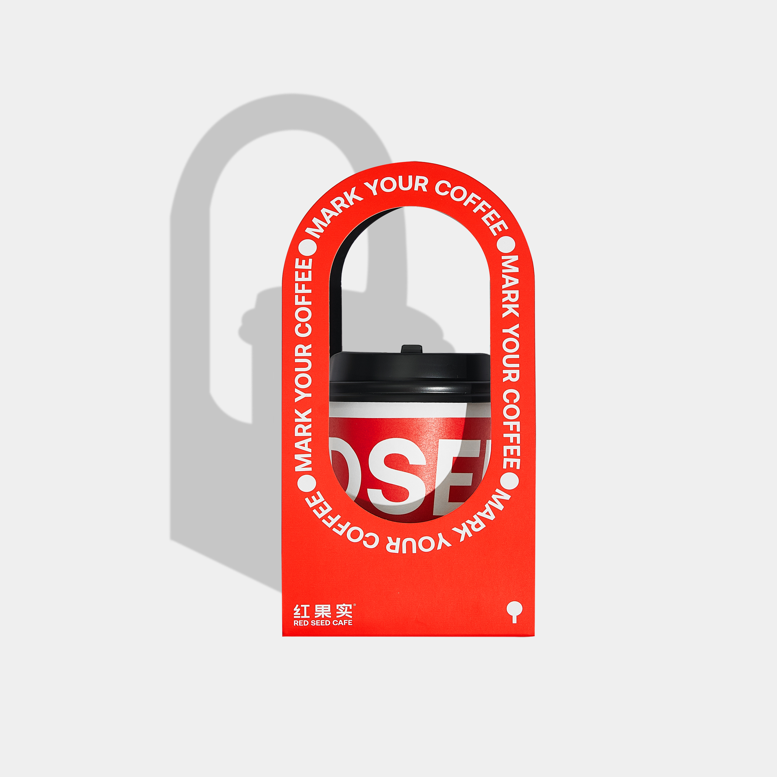
One of Reesaw’s most recent projects for the coffee brand RED SEED CAFE is a good demonstration of its color philosophy in creative design. RED SEED CAFE was founded in Yangzhou, China. The founder was attracted by the vibrant red color of coffee berries during his global travels to explore the coffee universe and therefore named his own coffee brand “Red Seed”. Needless to say, red is the primary color tone for the whole brand design. The red dots spread from the coffee shop to their paper bag. Some of the designs even get bolder with the color, such as the take-out paper cup and the cup carrier tray, which are immersed in red. At first glance, the bright red will give you a visual shock. It leaves a strong first impression in consumers’ minds and immediately helps them understand the brand’s concept.
Yin explained the idea of using the color red: “Our color logic is straightforward for RED SEED CAFE. We helped our client come up with the brand name. When we named it, we hoped to return to the original state of coffee fruit—red. The extension of the use of red as an embellishment helps present the sense of quality brought by the brand.”
While sometimes one simple color has the power to assist in establishing a coffee brand, other times, a mix of color palettes will be the key to making the specialty coffee out of sight. With the rise of online shopping, many specialty coffee brands abandon the traditional brick-and-mortar way and embrace virtual channels to sell their coffee.
In fact, specialty instant coffee is changing the game in China’s coffee market. Mintel Food and Drink found out that 58% of Chinese consumers drank instant coffee at least once a week, while 26% consumed it at least once a day in 2018. As the competition becomes fiercer in the field, the quality and standard for specialty instant coffee are growing. Consumers cannot be satisfied by the classic Nestlé instant coffee anymore. They are looking for something with a fresher coffee taste. During the Chinese Double 11 online e-commerce shopping festival in 2020, Saturnbird — one of China’s most famous specialty coffee brands — took first place in the instant coffee category on China’s biggest e-commerce platform Tmall. This was the first time Nestlé had been beaten in more than 30 years.
As more and more specialty coffee brands enter the game, differentiation is vital for brands in this market. An outstanding colorful packaging becomes a panacea to win the heart of the younger consumers, who are the main force of online consumption.

Take another one of Reesaw’s designs for the online-only Chinese coffee brand David Choice as an example. Apart from the signature “V” icon, the packaging color is definitely the other linchpin to help the brand stand out from the crowd in China’s competitive online retail channel. Orange with blue, green, and purple, David’s Choice packaging chooses a series of highly saturated contrasting colors. The bold contrasting colors make the products more eye-catching for young consumers.
Not only David Choice, the use of brighter and saturated colors can be seen more and more in specialty instant coffee packaging. For example, another famous Chinese instant specialty coffee brand, Yongpu, uses light yellow, sometimes even pink, and baby blue for their coffee packaging. While TASOGARE, another uprising Chinese specialty instant coffee brand, has chosen saturated red and blue for its packaging. These colors are quite unconventional choices for coffee packaging, as for many people, probably, the “coffee palette”—dark brown, blue, green, and red are the right color for a coffee brand. Nevertheless, bright color is an identical element to differentiate the new trend of specialty coffee from the traditional commodity coffee brands.
Of course, there’s a reason for those “ever-green” colors to appear on coffee packaging. Colors can sometimes carry strong connections to specific industries and ideas. Coffee is one of them. Brown is probably the most used color for many traditional commodity coffee brands, and it is simply because coffee is brown. At the same time, green is also widely used for coffee packaging because green is associated with natural, healthy, and organic. There is no denying that breaking the familiar color coding of coffee packaging is risky. However, the switch of preference reflects the change in the market.
The swap of the trend of color on the coffee packaging follows the change in the major coffee consumer group. Millennials are now the key target audience for many specialty coffee brands. Some 90% of the consumers of specialty instant coffee are aged between 18 to 35 years old, according to what Hengye Li from Secre Coffee in Guangzhou said in an interview with Perfect Daily Grind. These young consumers are very likely to work in the design, advertising, sales, and luxury sectors. Energetic, bright colors are more appealing to them and more visible on social media.
“Personally, I think that rich and bright colors are not the essence of the trend. Instead, the main reason behind this is the continuous iteration of younger coffee users. They would accept all kinds of new and innovative visual presentations. At the same time, with the increase in the popularity of coffee in China, the competition among coffee brands has become increasingly serious, making different coffee brands scrambling to seek breakthroughs. They have to use all different ways other than just the products to blow up the consumer market and become a phenomenon,” Yin told us in the interview.
Colors as Flavor Notes
Besides playing the role of the brand representative, color can do more for specialty coffee. The colors on the coffee packaging can also have practical functions for the coffee products. Accompanying the third wave of coffee comes the emphasis on quality in the coffee market. Many coffee brands, especially those specialty coffee, aim to bring out their own distinctive flavors. Usually, a specialty coffee brand would have a few different flavors. And colors are also commonly used to differentiate between coffee flavors.
According to a study published on ScienceDirect, the colors of the packaging labels could influence sensory and hedonic judgments of specialty coffee by amateur consumers. These consumers would have pre-tasting ratings of sweetness and acidity based on the colors they saw on the packages. This research finding would provide some functional benefits for packaging design to differ- The use of brighter and saturated colors can be seen more and more in specialty instant coffee packaging. entiate coffee taste. However, for many brands, the reason for using different colors for different flavors is much more straightforward.
From Saturnbird, one of the pioneers in China to use colorful packaging for its instant specialty coffee, to the innovative Nespresso, many coffee brands successfully generated unique visual memory for their products and created super brand symbols by converting different flavors into vibrant colors.

Hasbean Coffee Roasters, the 2022 Coffee Design Awards winner, also outplays other coffee packaging designs by introducing its unique palette of 8 colors for its rebranding. As part of the specialty roastery Ozone Coffee Roasters which has been in the industry for 20 years, Hasbean has one of the largest ranges of single origins. For the rebranding, in-house designers Ed Hughes and Fran Newman-Day want the new packaging to be more accessible to their consumers.
“Specialty coffee can sometimes be a confusing place, especially for newcomers, and Hasbean has always been about making great specialty coffee accessible to everyone. As we have one of the largest ranges of single origins, we wanted our customers to be able to quickly and easily break down the range into different flavor profiles. For us, color does this really effectively,” said Ed Hughes.
Starting off by conversing with the roastery team to single out what the different profiles might be; the team has eventually broken it into Sweet, Cocoa, Spicy, Fruity, Floral, Nutty, and Citrus plus Decaf. From there, each profile has been assigned a different color by the designers, according to the best representation of how these coffees would taste. For example, yellow matches citrus, while gray represents nutty flavors. The designers also added ample space for an expanded flavor profile description. This was written by the roastery team, and included information such as “floral notes” and “white sugar sweetness”. The aim was to explain the flavor notes better and avoid any confusion. All the effort on the packaging is meant to make the products more “user-friendly”.
Eventually, with the help of Pantone-inspired colors and flavor descriptors, consumers can instantly differentiate flavors by its visuals. Hughes told us: “We wanted people to get a steer on a coffee’s flavor before they’ve opened the bag. We were focused more on how the labels differentiate the coffees from one another. That was the main focus.”
However, finding the right color palette is not that easy. Moreover, many practical factors have to be considered during the actual design process, such as the costs and materials. For most coffee packaging design that focuses on colors, the quest usually starts with seeking the color that is in line with the brand positioning. This process requires the designers to have a deep understanding of a brand. Sometimes, it can be one simple color that gives consumers a tangible link between the color and the brand, like Starbucks. Other times, it can be a complementary color, which may convey a set of different features about the brand, and form a united personality.

For the Hasbean packaging, the designers’ aim was to find different colors for individual flavor profiles while simultaneously keeping all the colors harmoniously for one theme. During the six-month creative process, one of the biggest challenges for the Hasbean designers is to get all the colors to work together. The team has spent a long time doing many print tests to make sure each color sat well next to the other and reproduced well digitally and physically. This is hard, especially when the team is meant to develop a large color palette. It takes a lot of practice and experiments.
Nevertheless, no matter what color strategies have been approached, the goal is to differentiate the brand in the market. To be noticed, differentiation doesn’t mean finding a color that has not been used by other brands but tailoring it based on the brand’s positioning and personality, according to Yin. Once the primary color has been decided, the designers have to repeat the comparison of the rationality of the main color and auxiliary color collocation to reach harmony. The color also needs to be tested on the color cards and the actual packaging to ensure they align in the real world. Finally, the colorful packaging is ready to rock the consumers.
By using the right colors, specialty coffee brands can set themselves apart from the rest of the market. The colors can also be the messenger to deliver brand concepts to their consumers without rolling out all the tirades. Also, for some specialty coffee brands with a range of flavors, colors can be the labels for flavor notes. It would make the specialty coffee more down-to-earth and easier to approach by the new consumers. Even though coffee is all about taste and smell, colors help communicate it through visuals.
As specialty coffee marketing expands, the visual presentation of coffee will inevitably become more important in the future. Colors will keep on playing a pivotal role in coffee packaging. Yin thinks that we will see more diverse coffee packaging in the future. The use of color and visual effects will be more experimental to draw younger consumers’ attention. So, next time you shop online for specialty coffee, be prepared for a more diverse colorful world of coffee presentations ahead.


NO COMMENT