


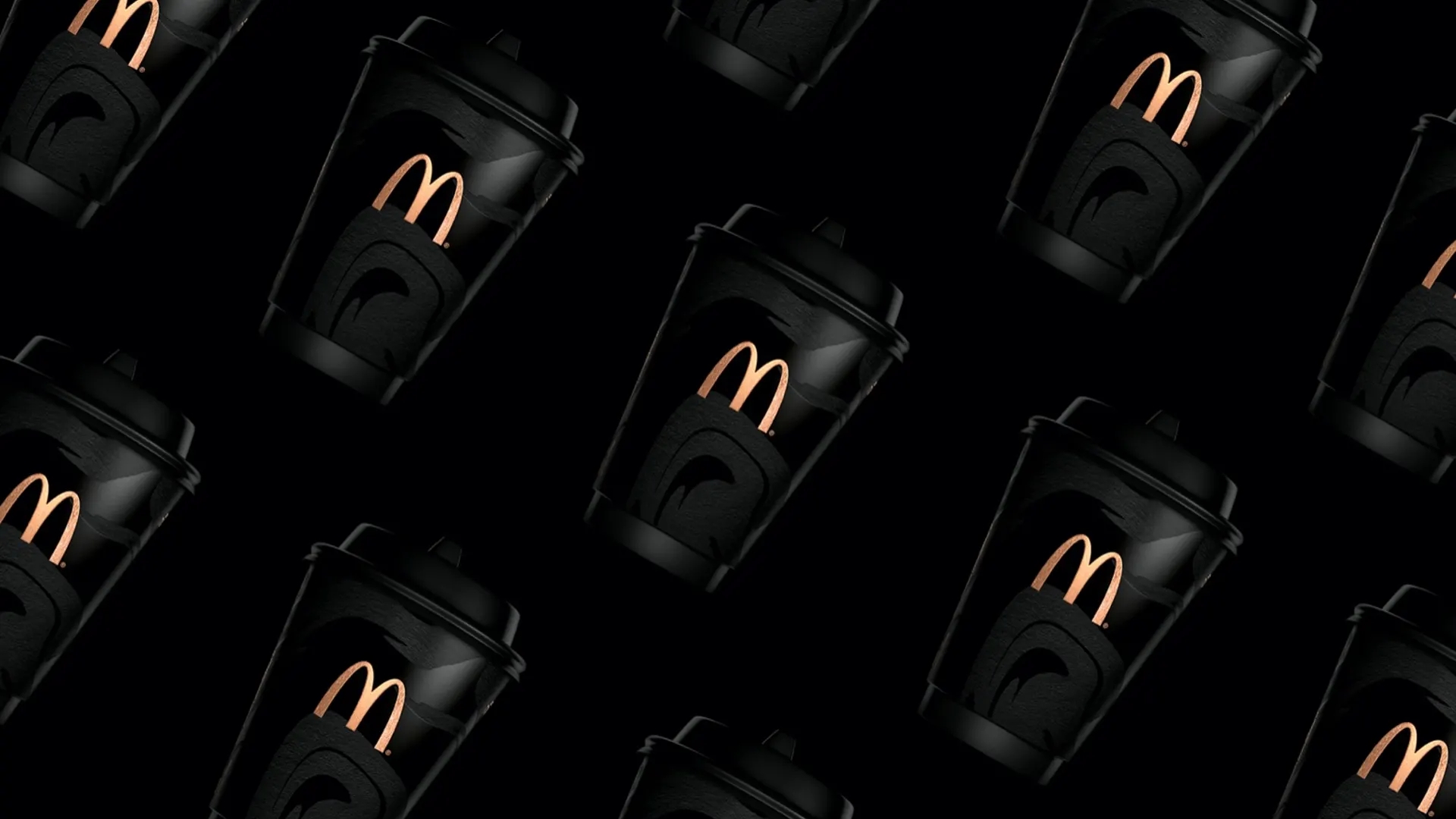
If it was not the bright yellow M logo, you wouldn’t have an idea this posh takeaway cup is from McDonald’s. It seems the brand has put more attention to its coffee sector, especially in details.
McDonald’s in Moscow launched a new package for hot beverage to attract more coffee-drinking customers, which is a re-branding project collaborated with branding agency Graphit. The idea is to bring coffee to the surface of the cup and touching all human sensory organs.
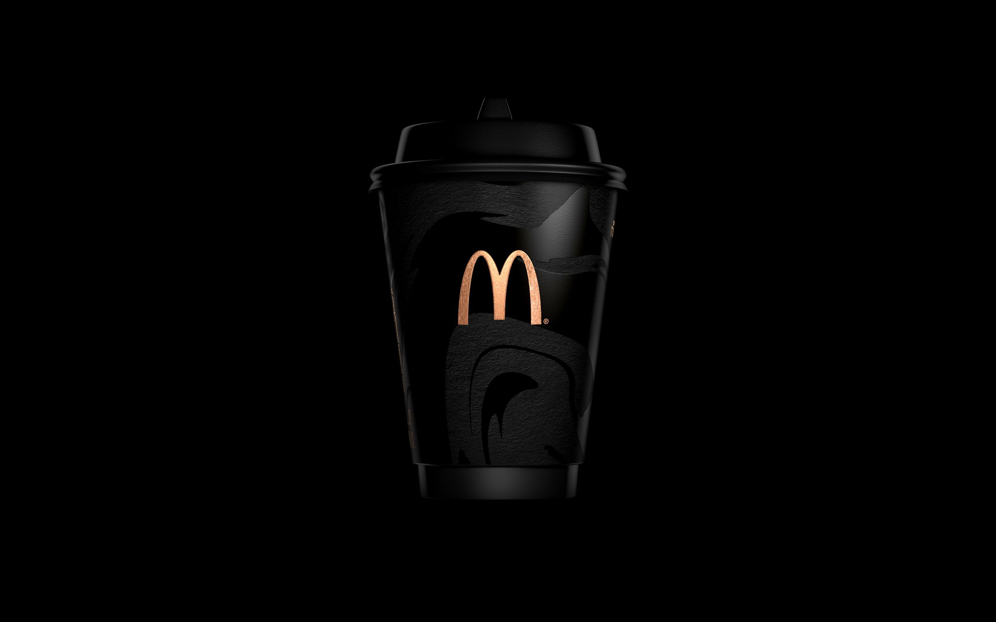
Graphit uses a deep black color as the base to represent the strong coffee and a texture of stains for the branding of the cup. The smart soft-touch technology is transmitted slick surface into matte. The brand wants to give customers a more sophisticated experience, sensing all aspects of coffee, not only about taste but also visual and tactile.
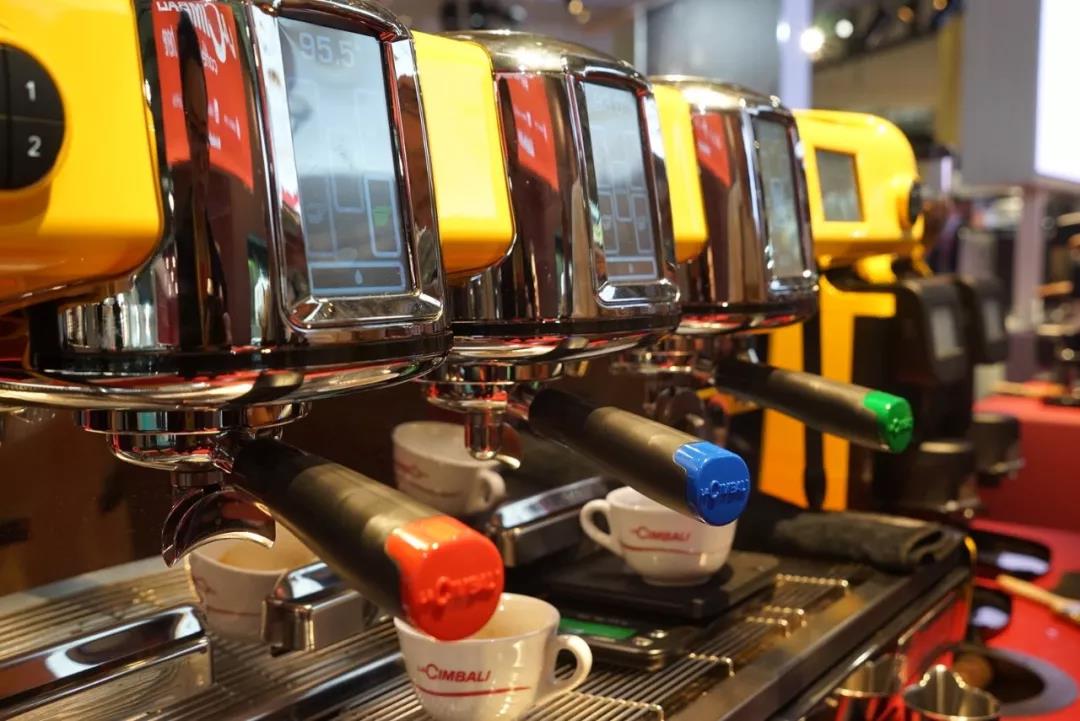
It’s interesting that at the 2019 Host Milano, LA CIMBALI presented one M100 ATTiVA in bright yellow, a customized version for McDonald’s in China. The machine has three portafilters in different colors, which is red, blue, and green. It adopts visual recognition technology (color) to connect the espresso machine with the grinders, which can recognize the pre-set data for extraction automatically.
With those well-designed details, it is possible to appealing more customers to come in, get a cup of coffee, and post on the Instagram.

NO COMMENT